School lunch photos are back in the news. First, there was the story about the FedUp campaign on NPR’s The Salt. My reaction – and their response – are at What School Meals REALLY Look Like Today. Now, USA Today wants to know “What does your school lunch look like?” If you believe, as I do, that media coverage has been skewed to outdated and inaccurate images of school meals, there is something that you can do – something that you must do.
It’s time to flood social media with gorgeous photos of real school meals – the EVERY DAY GOODNESS that is prepared in your kitchens and served in your cafeterias and classrooms! A smart, beautiful photo is worth a thousand words – and thousands of views. That’s why School Meals That Rock is featuring SMART TIPS FOR PHOTOS THAT ROCK. Get your Smartphone or camera ready – and start snapping!
TIP #1: TAKE LOTS OF PHOTOS. Seriously, in order to get great photos that do justice to your great meals, you have to practice. So, just do it today. Take lots of photos and delete all of them if they are not as good as you would like. The only way to get good at taking photos is to practice, practice, practice. There are tons of photo ops in every school kitchen and cafeteria – check out the photo gallery at ITS Meals at Provo School District for tons of examples.
Food Day 2013 tray from Decorah, Iowa
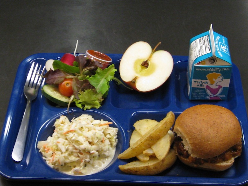
Tip #2: USE A SOLID COLOR TRAY. Deep blue, green and red seem to compliment most school foods best. Natural and black can also work well. Steer away from swirled colors and pastels. Very few foods look delicious on mint green or pink. If you don’t have the right tray, borrow or purchase one to use for daily photos. If you use plates instead of trays, show your meals on plates. The photo above – from a lunch of locally-sourced foods served in Decorah Community Schools in Iowa – rocks for many reasons: The tray color is just one of the them. The meal below may meet all nutrition standards, may be delicious and may even include local foods, but it is hard to see the food for the swirling blue and white colors.

Swirled colors make it hard to showcase delicious food
Tip #3: KEEP BACKGROUND SIMPLE. Help the viewer focus on the food by eliminating distracting background patterns. One of the best backgrounds is a clean stainless kitchen counter or cafeteria table. While the meal below has some great options, there are too many districting patterns in the background, plus we cannot see what food is in the box. There is also no reason to include the bottle of soy sauce – a carton or bottle of milk would be much better.
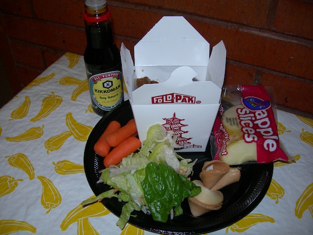
Too many patterns in the background distract from the food
BOTTOM LINE: If you want the world to have a more accurate, current and POSITIVE image of school meals, YOU have to share the EVERY DAY GOODNESS in your cafeterias.

Pingback: School Food Gets Its Close-Up, But Is It a Fair One?
Pingback: DoSomething.org’s Fed Up Campaign Inaccurately Portrays School Meals